
Nature-Inspired Color Palettes for Home Decor
Discover the timeless elegance and calming power of nature-inspired color palettes for your home decor. Drawing from the enchanting spectrum of the great outdoors, these palettes bring serenity, energy, and harmony into any room. Whether you seek the tranquility of a forest or the freshness of a sunlit beach, embracing nature’s colors can transform your interiors into welcoming sanctuaries that reflect both personal style and the serenity of the natural world.
Earthy Tones and Organic Warmth
Rich Terracotta Hues
Inspired by sun-baked clay and arid landscapes, terracotta hues bring an artisanal touch to any room. These deep, burnt oranges and reds evoke a sense of coziness, especially when paired with natural textures like rattan or unfinished wood. Infusing terracotta into your home can be as simple as adding throw pillows or painting an accent wall. The versatility of this shade means it pairs well with creams, olive greens, and even deep blues, helping to ground a space and provide a sense of lived-in warmth while staying on trend.
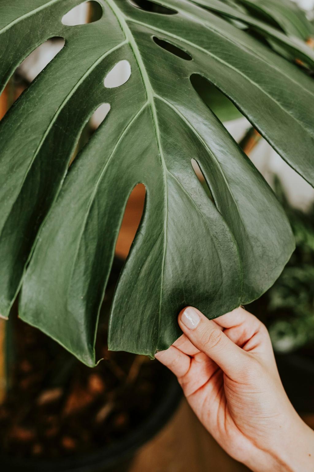
Vibrant Emerald Green
Emerald green is reminiscent of fresh spring leaves and thriving woodland canopies. This rich, saturated color works beautifully on statement furniture pieces, drapery, or even cabinetry. Incorporating emerald elevates a room’s energy, marrying luxury and naturalism. It reflects light differently throughout the day, always offering a dynamic focal point. Use it to create dramatic contrasts with neutral colors or as an accent that celebrates natural abundance, ensuring your home remains both lively and harmonious.

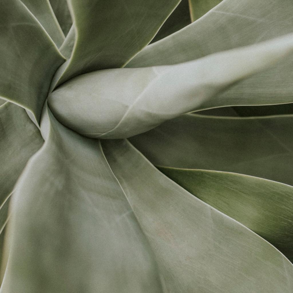
Soft Sage Green
Soft sage green offers an understated, versatile touch of the forest—subtle yet unmistakably reminiscent of dew-laden leaves. Its gray undertones make it sophisticated enough for modern design while still soothing and organic. Use sage on walls for a tranquil background, or introduce it through textiles and ceramics for quieter whispers of nature. The calming essence of sage makes it ideal for spaces intended for relaxation and reflection, such as bedrooms and reading nooks.
Ocean-Inspired Blues and Aquas
Crisp Aqua Refresh
Aqua shades recall the crystalline clarity of shallow, sunlit waters. This light, invigorating blue-green lifts and enlarges spaces, making it perfect for bathrooms, kitchens, or any area in need of a revitalizing boost. Pairing crisp aqua with white and sandy beige evokes a breezy, coastal atmosphere that feels both uplifting and timeless. Strategic accents in this hue can also provide energy and optimism, without feeling overpowering.
Tranquil Deep Sea Blue
Evocative of the ocean’s mysterious depths, deep sea blue delivers a moody, elegant ambiance. Perfect for bedrooms or study spaces, this dramatic color encourages introspection and relaxation. Its rich undertones pair beautifully with metallic golds or warm neutrals, resulting in sophisticated contrast. Incorporate deep sea blue through wall paint, upholstery, or large statement art for a look that exudes calming luxury and connection to the boundless sea.
Sunny Sky Blue
Sunny sky blue captures the carefree recommendation of clear, cloudless days—offering mental clarity and a touch of playfulness to any interior. This airy shade works especially well in open-plan living areas or children’s rooms, creating a feeling of lightness and openness. By pairing sky blue with soft whites and fresh greens, your decor will radiate positive energy and an enduring connection to the peaceful rhythms of the sky.
Floral and Botanical Influences
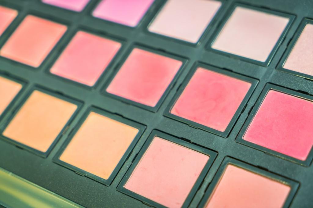
Soft Blush Petals
Soft blush evokes the gentle allure of rose petals and cherry blossoms, offering an inviting feminine touch to interiors. Use it for walls, bedding, or textiles to impart a sense of understated luxury and tenderness. This hue pairs beautifully with gold or brass accents and deep greens, providing a delicate yet sophisticated focal point. Soft blush can warm up a neutral palette or create a quietly romantic retreat, ideal for bedrooms and sitting rooms alike.
Bold Botanical Green
Bold botanical green recalls the vibrant energy of jungles and lush foliage. This saturated shade makes a statement on accent pieces or feature walls, breathing fresh life into any space. It speaks of health, growth, and renewal, making it perfect for living areas and kitchens. Pairing botanical green with earthy browns or sunshine yellows highlights its vivacity and creates a dynamic space that feels forever alive yet harmoniously connected to nature’s cycles.
Sunshine Marigold
Inspired by fields of wildflowers and sunny meadows, marigold delivers a joyful pop of golden yellow to your decor. This radiant color is ideal for accessories like cushions, vases, or artwork, instantly lifting the mood of a room. Marigold infuses spaces with optimism and warmth, working especially well in communal spaces where it encourages sociability and cheer. Pair it with soft greens and warm neutrals for a balanced, nature-inspired ambiance.
Previous slide
Next slide
Golden Wheat Tones
Golden wheat shades evoke the glow of ripened fields swaying in the sunlight. This warm, approachable color sets a welcoming tone in kitchens, dining areas, or entryways. Its subtle vibrancy pairs wonderfully with white trim or natural stone, creating a timeless backdrop that encourages conviviality and ease. Integrating golden wheat through painted surfaces or textiles brings natural richness and a sun-kissed ambiance to any room.
Toasted Almond Brown
Toasted almond brown mirrors the wholesome, satisfying tones of autumn harvests. This creamy, light brown enriches spaces with understated comfort and approachability. Incorporate toasted almond in furniture, rugs, or cabinetry to achieve a feeling of lasting warmth and groundedness. In combination with terracotta or olive green, this brown completes a layered, nature-inspired retreat that feels both well-curated and authentically lived-in.
Sunny Marigold Accent
Sunny marigold, drawn from both blooming meadows and golden hour skies, acts as a versatile highlight. Use it on throw pillows, artwork, or accent chairs to inject instant cheer and vibrancy into a space. It complements earth tones, pale blues, and lush greens, creating interiors that balance energy with tranquility—perfect for brightening social areas or workspaces with touches of the harvest sun.
Woodlands at Dusk

Twilight Lavender
Twilight lavender, with its muted purple tones, conjures the peaceful quiet of dusk settling over woodland clearings. This sophisticated color introduces a gentle touch of whimsy without overwhelming the senses. Perfect for bedrooms and sitting rooms, twilight lavender pairs delicately with sage greens, cool grays, and natural woods to foster tranquility and a subtle sense of wonder.
Inky Indigo Blue
Inky indigo brings the enigmatic depth of nightfall to home decor. Profoundly calming and richly pigmented, indigo works as both an accent and a main color, perfect for adding drama to walls or textiles. It harmonizes beautifully with metallic accents and creamy neutrals, producing a moody and magnetic effect evocative of starlit skies viewed through the treetops.
Rustic Chestnut Brown
Rustic chestnut brown mirrors the sturdy trunks and weathered bark of ancient trees, infusing interiors with reassuring strength and a touch of timelessness. Use chestnut in wood finishes, flooring, or decor to ground lighter palettes and lend authenticity. Its organic character helps create cozy, intimate environments, particularly when juxtaposed with plush fabrics and soft lighting.