Organic Color Schemes for Serene Living Spaces

Immerse yourself in the tranquil beauty of nature-inspired color palettes specifically curated for serene living spaces. Organic color schemes draw from the soft, earthy, and harmonious tones found in nature, nurturing atmospheres of relaxation, balance, and understated elegance. By thoughtfully harnessing these shades, you can transform your interiors into restful sanctuaries that soothe the soul and invite peaceful living.

Embracing Earthy Neutrals

01

Warm Taupe and Soft Beige

Warm taupe and soft beige tones set a serene foundation for any living space. By mirroring the gentle variances in sand, driftwood, and smooth pebbles, these hues offer quiet elegance without overwhelming the senses. Their adaptability allows furniture pieces and décor accents to harmoniously blend, while also reflecting natural light in a way that enhances spaciousness and warmth. Whether used on walls, upholstered in seating, or woven into textiles, these organic tones create a comforting oasis ideal for unwinding.
02

Subtle Stone Grays

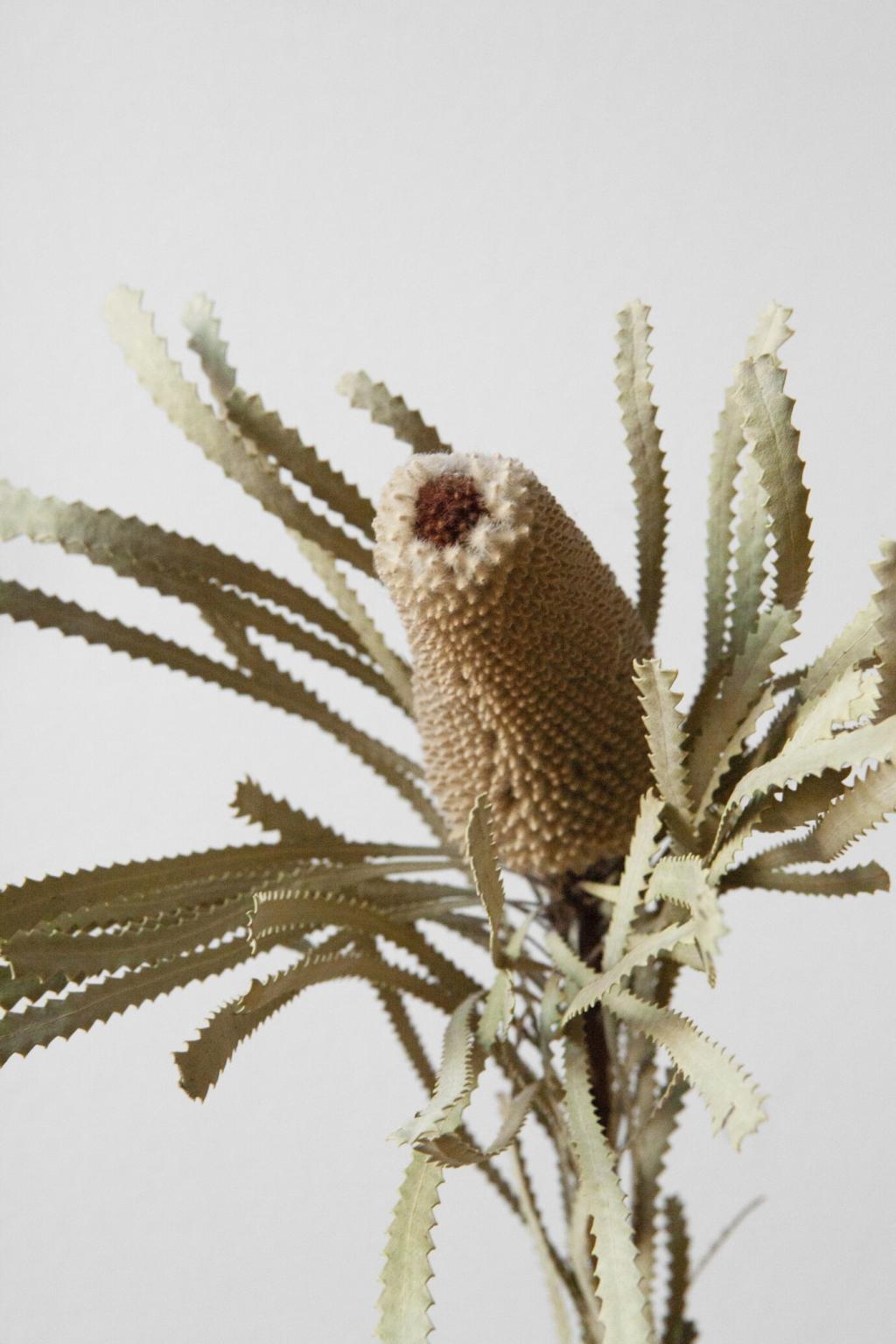
Stone-inspired grays capture the understated beauty of natural rock formations and minerals. Softer than industrial grays, these shades are tinged with hints of brown or blue, capturing the tranquil spirit found in mountain vistas or riverbank stones. Used as the primary color for walls, area rugs, or cabinetry, subtle stone grays serve as a neutral backdrop that is anything but cold, inviting touches of color from plants, wood grains, or handcrafted ceramics to emerge more vibrantly within the serene setting.
03

Creamy Whites and Off-Whites

Creamy whites and off-whites evoke the purity and simplicity of nature’s softest textures, like eggshells, seashells, and cotton. These hues elevate luminosity throughout the living space, making rooms feel airy and open while maintaining a sense of warmth that stark, clinical whites can lack. In serene living rooms and cozy nooks alike, creamy whites envelop the space in a gentle glow, inviting calm and serving as a seamless canvas for layered materials and subtle organic accents.

Infusing Gentle Green Tones

Muted sage and moss greens recall the quiet serenity found in woodland or forest floors. These hues possess a silvery, subdued quality that makes them particularly versatile for living spaces, offering a refreshing yet understated dose of color. Whether featured on walls, in statement furniture, or through soft furnishings, these gentle greens bring a sense of organic life indoors, complementing wood accents and natural textiles for a cohesive and calming design.
Powder blue and misty sky hues offer reminders of calm horizons and gentle daylight. These soft blues impart a sense of serenity and openness, making living areas appear both more expansive and tranquil. Integrated through wall colors, area rugs, or delicate textiles, powder blue and misty sky tones create an ambient environment perfect for stress-free relaxation or quiet social gatherings, seamlessly blending with other organic shades for a unified look.